Article
UI design for deep tech: challenges and strategies


- By
- Alex Lenz & Niels Kösterke
- Reading time
- 7 minutes
- Updated
In recent years, we’ve had the privilege of guiding more and more deep tech companies on their journey toward user-centered products and business models. Deep tech usually means uncharted territory: entirely new domains, specialized subject areas, and highly complex functionalities. At first, there are many questions from users, investors, and even us. It’s a good thing that UI design can quickly provide an initial sense of possible solutions and visions for the product.
In this article, we’ll share some insider tips. You’ll gain insight into the importance of user-centered interfaces in complex tech applications and get practical advice on how the right design can give your product a boost in various ways.
Fundamental challenges in the deep tech landscape
Digital products by techies for techies: this comes with very specific starting conditions and requirements.
First, let’s look at the product itself. Its functionality is typically so complex and intellectually challenging that every effort must be made to make it understandable. This applies to users, but also to investors, internal stakeholders, and those who purchase the product. You should be aware of this “persona clash”: Users are often not the buyers. The design must convince both groups.
To do this, we as designers must first understand the product ourselves. The usual process of familiarizing ourselves with the market environment is, by its very nature, not so easy when the market doesn’t yet exist. Even the question “How do others do it?” leads nowhere; you can’t rely on best practices when dealing with completely new business models. Incidentally, this also applies to wording. Terms and labels must first be defined by us and then applied consistently to prevent any ambiguities or misunderstandings.
Deep tech is also associated with a fast pace. Products must be brought to market before the competition overtakes them or funding runs out. Ideas are conceived, tested, built, iterated, and scrapped quickly. Requirements are constantly changing; features are added or removed, and, especially in a startup context, the market-ready product never looks exactly like the initial design.
Furthermore, innovative products must demonstrate that they are fundamentally different from the market leader, whose technology has long since become obsolete. They need to stand out, set themselves apart, and have a certain “cool” factor.
What makes for good UI design?
Breaking down complexity
The essential role of design in tech applications: breaking down complexity and making it usable. The essentials must be highlighted, and functionalities must be visually conveyed in a concise manner. A wide range of user questions must be anticipated and addressed within the application without interrupting the user flow. Which brings us to the next insight:
Products are intuitive and fun to use
Techies don’t read manuals. The application must be designed in such a way that users can explore it and figure it out on their own. And: Developers are discerning: products must not only look good and enable a seamless user experience, but they should also be fun. The design must make users eager to try out a new product.
Design is innovative and unique
It should also be as fresh and modern as possible to highlight the company’s innovative character and position itself as a young, smart player in the market. The design should be just as new and unique as the product itself.
Speed meets systematic approach
Especially for startups, design has to walk a fine line: It needs to spark interest in the initial idea right from the start, but it also has to be able to support the future product, at least in its fundamentals. Moving quickly and taking a systematic approach both go hand in hand.
The challenges
Cliché
Don’t expect work based on a briefing or a textbook. There won’t be any plodding through long- or medium-term plans. The fast pace demands flexibility, and teamwork, at every stage. The design team must work closely with the development team; going it alone is even more doomed to failure here than in other industries.

Love at first sight
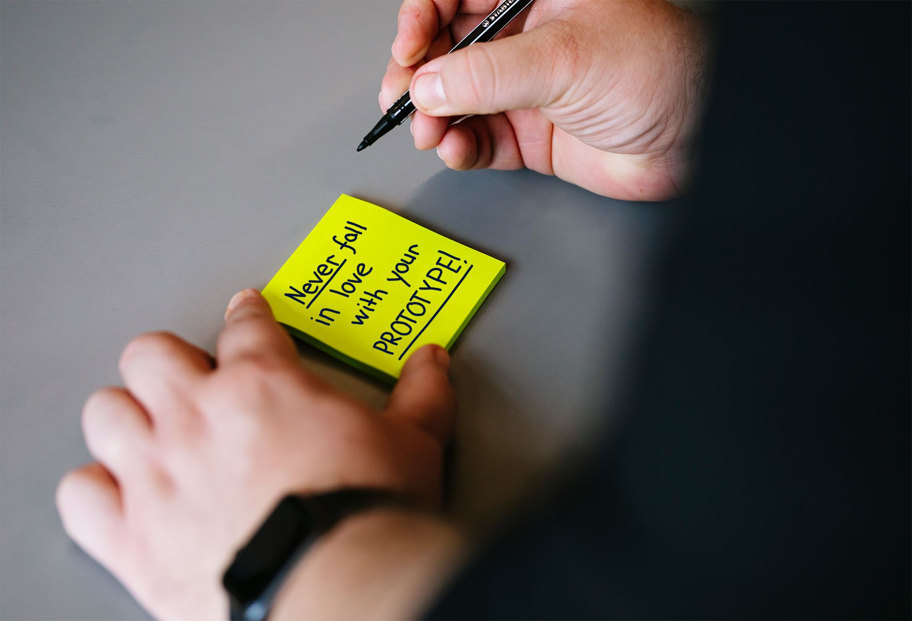
Right at the very beginning of the startup lifecycle, when the product doesn’t even exist yet and the vision is still on shaky ground, something visual is needed quickly. It has to look good enough to get investors and stakeholders excited. Often, features are included that are still a long way off and may never be implemented (in that form). That initial visual concept quickly becomes the UI design, even though the product will undergo a complete transformation over time.
Therefore: Don’t fall in love with your first solution, or your second or third, for that matter. They’re disposable products that you should consistently let go of once you reach a certain point. During iterations, consciously avoid getting too bogged down in details; sketch things out quickly: agility is essential.
Sometimes it makes sense to take a two-pronged approach: on the one hand, developing fast, sleek designs that make a strong external impression; on the other, building the product from the ground up. During our work for Instana, an initial UI featuring an interactive 3-D map sparked many people’s interest in the product and encouraged them to invest. The competition used tables, which may have clearly reflected how the product worked, but looked completely devoid of any fun. The 3D map, which was initially Instana’s flagship feature and driving force, now plays only a minor role in the product and has since been supplemented by many other features.
You are not the user
What sets deep tech companies apart is that the founders almost always have a tech background themselves and are potential users of their own products. This dual role can pose challenges during the design process. The mindset “You are not the user” should always prevail here. Even though it may be tempting, hypotheses should not be tested based on personal intuition, but always through valid user testing.
A passion for technology
The dual role of founders as developers can also have an impact on the product’s feature set. Naturally, founders are enthusiastic about their technology and want to implement as much of it as possible for users. However, this carries the risk of overloading the product. In our projects, much of the scope is trimmed by the UX design, and then even more is cut during the UI design phase. When in doubt, the motto is: Let’s leave it out for now; if something is missing, it will quickly become apparent during user testing.
Strategies and tips
Back-and-forth with the developers
After immersing ourselves as deeply as possible in the subject matter and the industry, we sit down with the founders and developers to dissect the product together. We try to get all the details out of everyone’s heads and then set about visualizing the individual elements. This helps everyone understand the product better, discuss it in a focused way, and identify initial pitfalls. The developers, too, quickly start coming up with ideas.
Finding analogies
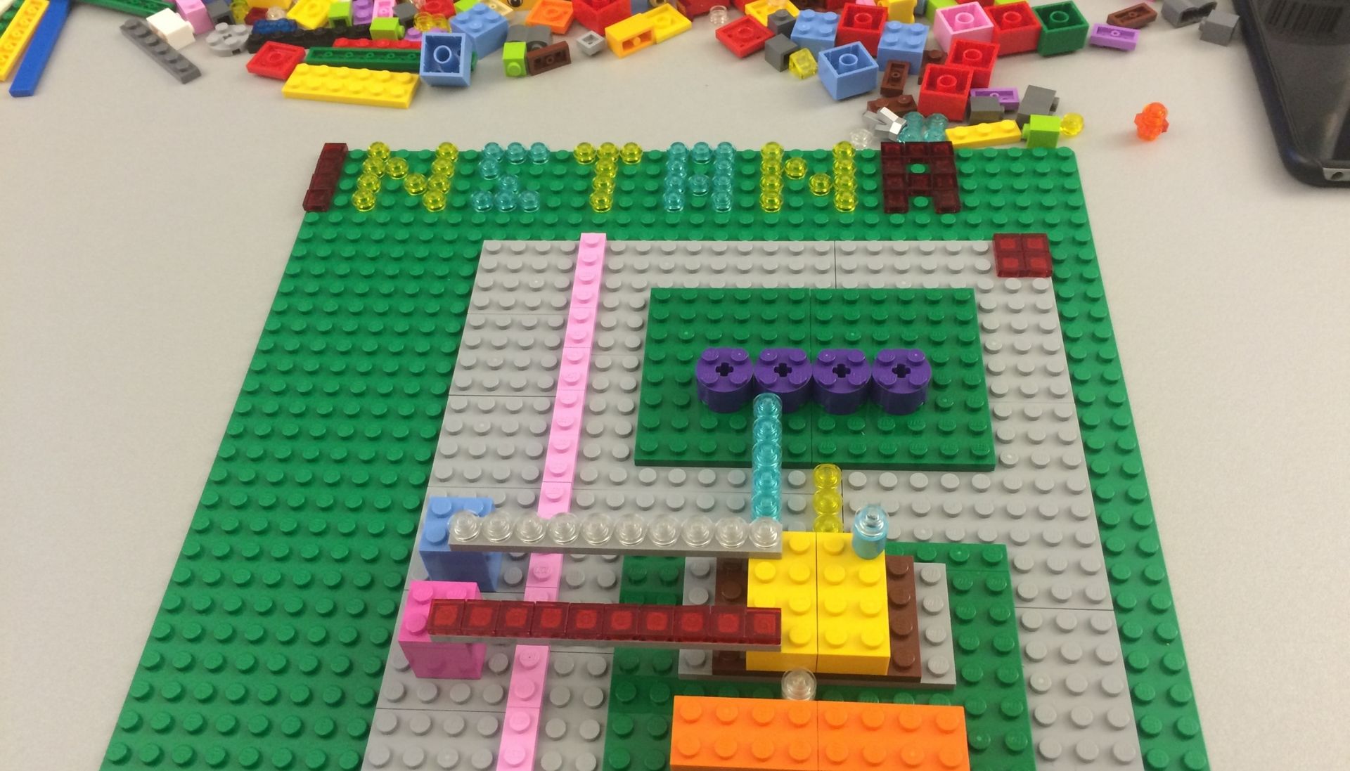
Especially in the startup context, we often have to visualize concepts that don’t yet exist. In such cases, it’s a good strategy to draw analogies to familiar concepts from other areas of life. For example, you could depict an IT infrastructure as a city. It’s also helpful to incorporate a playful element. At Instana, for example, we visualized the founders’ vision using Lego. You can read more about this in our showcase: From Solingen to Silicon Valley: Instana & the Mega-Deal.
design system
Even when time is of the essence, it’s worth building things systematically and modularly so they can be easily reassembled. We set up a design system as early as possible in almost every project. It can start out very basic and evolve over time. You can read about the benefits of a design system and how to set one up in the article by Fabienne, Philipp, and Markus: “Design system: the base camp for your product team.”
Design studios
It’s
important for the entire team to develop a shared understanding and speak the same language. A design studio (also known as Crazy 8 or Crazy 6) is always a good way to achieve this. Through rapid sketching, pitching, and evaluating, a lot is communicated, and shared solutions emerge in no time. You can find a more detailed description of the method, including a PDF “recipe,” in Nina’s article “Deep Tech Meets User-Centered Design: Two Practical Methods to Get Started.”
Regular reviews
Precisely because of the fast pace, it’s sometimes hard to keep track of ongoing processes and to be aware of which steps have been completed and what that means for further development. That’s why we like to get together every two months for a retrospective. We review everything we’ve done over the past eight weeks and then apply the insights we’ve gained to the system.
Don’t be afraid to ask questions and experiment
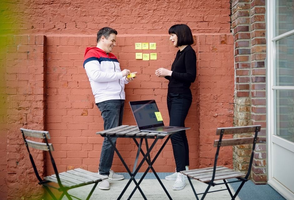
The more complicated things get, the more important it is to ask questions. Don’t settle for half-knowledge or guesswork. As soon as something isn’t clear to you, ask about it. Likewise, don’t be afraid to simply try things out using common sense. There’s no shame in it if it doesn’t work.
Conclusion
UI design must meet specific requirements in innovative technical applications. The visual presentation must succeed in making complex relationships and functionalities understandable and, especially in the early startup phase, appealing to a diverse audience. The design must constantly adapt to the evolving product. Close collaboration, focus, flexibility, and curiosity are essential. And that’s exactly what makes it so exciting for us.
Our experts
Alex is one of the first UXIs, and brings over 10 years of product design experience along with a keen sense for team structures, planning, and processes.
Niels is already a design veteran at UX&I: He was one of the first specialists hired by UX&I and is right at home tackling exciting and complex projects.