Article
UX as a game-changer: a major opportunity for European software


- By
- Christian Korff & Mona Reimholz
- Reading time
- 10 minutes
- Published
More and more companies are considering moving away from U.S. software. Data privacy is one issue, but by no means the only one. Political tensions and the desire for digital independence are creating new momentum in the market. European providers are feeling the impact: Demand is rising, even in the enterprise sector. But anyone looking to move away from U.S. products quickly encounters a familiar pattern: functionally sound, but often lacking in terms of UX and usability.
We’re experiencing this firsthand right now, and we’ve recognized an opportunity in it. Because right now, European tools can show what they’re truly capable of: not only secure, but also user-centered. Those who think strategically about UX won’t be seen as an alternative, but as a genuine recommendation.
What began as a security-focused movement is evolving into a genuine market dynamic: European software is gaining visibility, in tenders, in proofs of concept, and on the shortlist for new platforms. Companies such as Nextcloud, OpenCloud, IONOS, and Magic Earth are reporting a significant increase in user numbers (see DER SPIEGEL, 16/2025, article by Angela Gruber). For many providers, this is uncharted territory. As demand rises, so do expectations: not only regarding data protection but also in terms of product quality and UX.
We’ve noticed this in our own work as well: Especially in the course of our ISO 27001 certification for information security, we’ve re-evaluated numerous tools focused on information security. The result: Most European solutions meet the formal security requirements. But when it comes to user guidance, clarity, and practicality in everyday use, weaknesses often become apparent.
This is precisely where the challenge, and the opportunity, lies: Those who invest in UX now will not only set themselves apart from the competition but will also become a genuine alternative in the first place. In fact, the topic has already made it to the big stage. Thomas Jarzombek, State Secretary in the newly founded Ministry of Digital Affairs, explains quite clearly: “We need a focus on UX” (see “Naturally Intelligent,” AI newsletter from “Die Zeit”, May 15, 2025, article by Jakob von Lindern). The General Assembly of the Software Alliance Germany on May 22, 2025, also revolved largely around the topic of digital sovereignty.

“I am convinced that digital sovereignty also begins with productivity. The challenge: finding a solution that doesn’t feel like a compromise. Our team is used to working with tools that clearly stand out in terms of usability. This makes it all the more apparent where European solutions still have ground to make up today.”
Where does European software stand today? And what can we learn from this?
European tools are catching up, no question about it. But when it comes to UX and usability, they often fail to realize their full potential. The weaknesses aren’t always dramatic, but they add up: cryptic navigation paths, inconsistent states, missing guidance systems, cluttered interfaces, or a lack of fault tolerance. These are problems that not only frustrate users in their daily work but also erode trust, and thus jeopardize the acceptance of entire systems. This is particularly critical in the enterprise environment, where digital products rarely explain themselves. Here, it’s not enough to simply be GDPR-compliant. Tools must also feel intuitive, be easy to use, and actively provide support when things go wrong.
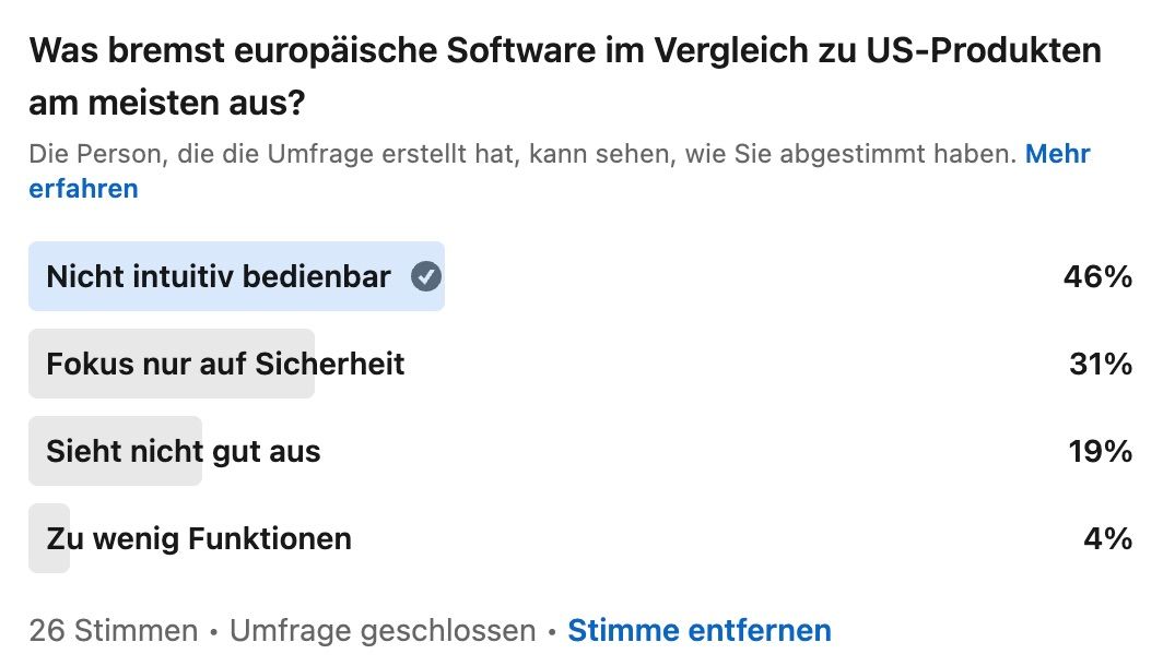
Our LinkedIn survey (May 2025) also confirms this picture: At 46%, intuitive usability is perceived as the biggest shortcoming of European software.
Our review: A comparison of three tools
What stands out when you look at European tools from a UX perspective? Where is there concrete room for improvement? Our senior UX consultants, Mona Reimholz and Christian Korff, examined three solutions that are typically part of everyday work, each in direct comparison with leading U.S. providers:
- AI Chatbot: Le Chat (Mistral) vs. ChatGPT (OpenAI)
- Project management: MeisterTask vs. Asana
- Whiteboard: Conceptboard vs. Miro
A direct comparison highlights where weaknesses, opportunities, and typical UX patterns lie. Below, we present the key findings.
Le Chat (Mistral) vs. ChatGPT (OpenAI)
Mistral is considered the European alternative to ChatGPT, more secure, more open, and developed locally. But what’s it like to use?
- There is only one language model available. This means there’s no way to select appropriate models for different use cases. For us, this is a clear advantage of ChatGPT.
- Responses appear in full without delay, which comes across as robotic, lacking the feel of a human conversation. It may also give rise to subconscious skepticism: can the result really be correct if it’s delivered so quickly?
- The language and tone of the conversation come across as stiffer and less approachable.
- There is a lack of proactive guidance, such as next steps or suggestions. The conversation must be driven by the user.
- The organization of chats is unclear, especially in conjunction with the libraries. It is unclear whether content uploaded to the library is available for use in all chats. ChatGPT offers better and more intuitive options here with its project feature.
- Copying and pasting results is tedious because they contain extensive Markdown. Overall, the presentation is more unstructured and less easy to grasp. The question of how users can (continue to) work with the answers apparently took a back seat.
Conclusion: Le Chat comes across as largely detached, both linguistically and functionally. The technical foundation is solid (and the image generation is impressive), but the user experience is matter-of-fact and isolated. You’re constantly aware that you’re communicating with a machine, whereas ChatGPT’s communication comes very close to human conversation. On the other hand, Le Chat scores points with a more playful product concept; the name “Le Chat” alone feels more approachable than the austere “ChatGPT.” The model names in ChatGPT are also very technical; the U.S. tool has some catching up to do in terms of user-friendliness.
MeisterTask vs. Asana
MeisterTask promises simple project management from Germany. But how user-friendly is the system in everyday use?
- The onboarding process at MeisterTask is very detailed, which makes it complicated. It doesn’t help users find the most important features right away; instead, it feels confusing and overwhelming. In contrast, Asana offers a well-designed, quick onboarding process that lets you jump right into your first project, along with the option of a live call for support.
- Well-known UX/UI standards (such as Jakob’s Law) are sometimes not followed in MeisterTask. For example, unfamiliar variants are used instead of common icons or patterns. In some cases, familiar interaction elements do not behave as expected (e.g., a kebab menu opens in a global modal instead of a context menu).
- The information architecture is, at least for first-time users, not intuitive. Important functions require detours and are difficult to access or locate. For example, it took us a long time to create our first task and place it on the home dashboard, a basic introductory function.
- Visually, MeisterTask is less appealing: a distracting default background, text that’s hard to read, and a lack of visual hierarchy. The well-intentioned lavender field, for example, unfortunately creates a rather unstructured overall look.
Conclusion: While Asana actively guides users through the onboarding process and follows conventional design principles, MeisterTask still presents users with hurdles, especially during the early stages of use, which are critical for a decision to switch.
Conceptboard vs. Miro
Conceptboard is functional, but its design and structure are outdated.
- The UI looks outdated, and the visual design is uninviting. Drop shadows look like they’re from the early 2000s, and sticky notes come in only garish colors by default. While these can be customized (a feature missing from Miro), the process requires unnecessary clicks to locate individually selected shades.
- There are hardly any playful or engaging elements; overall, the product comes across as rather cold and technical. The accompanying email onboarding attempts to build a multi-step learning process over several days, with content and graphics that are visually quite separate from the tool and do not reappear there. Furthermore, the learning process takes place independently of actual usage, which weakens the connection to the product.
- Important features like templates are hard to find, and we can’t find a wireframe library at all.
- A pen for scribbling is preselected as the default mode. It would make more sense to use the mouse pointer to navigate the board initially. Furthermore, the “Scribble” feature is not listed first among the various modes, but rather in the middle among the others. The interface thus suggests a priority based on the default mode, which is not reflected in the arrangement of the features.
- System messages are often phrased in technical and sometimes incomprehensible terms, leaving users unsure of what happened and what to do next.
- In general, usage is repeatedly hampered by minor friction points: connection lines can no longer be edited, elements must be selected as a whole, icons are unrecognizable, and moderation functions are hardly intuitive.
Conclusion: Conceptboard works, but it doesn’t feel quite polished. Getting started is cumbersome, and the user experience is technically oriented. Miro is significantly clearer, easier to use, more accessible, and more modern. Conceptboard is only one step ahead when it comes to customizing the colors of sticky notes.
Recurring patterns
The audit revealed three fundamental weaknesses in particular that affect product usage, and can quickly become a problem in practice.
- Unclear structure
One thing that stands out about European tools is that key functions are hard to find or aren’t located where you’d expect them to be. The information architecture often doesn’t seem tailored to typical usage scenarios.
- Inconsistency and deviation from expectations
Familiar patterns and interactive elements, such as menus, icons, or navigation elements, behave differently than expected or are replaced by custom designs. This makes it harder to find one’s way around, unsettles users, and leads to unnecessary detours. Instead of drawing on existing knowledge, users must devise new strategies, which increases the cognitive load.
- Lack of aesthetic appeal, not much fun
In many cases, the design, language, and interaction come across as distant or outdated. Visual elements are sometimes cluttered, and the tone ranges from matter-of-fact to stiff. There is a lack of design clarity and moments that make using the software enjoyable or motivating. This undermines a positive user experience, and thus the willingness to work with the tool.

“The onboarding process, in particular, was difficult to follow in several tools, yet this is precisely the point at which people decide whether they’re truly willing to switch.”

“Many shortcomings seem trivial: a menu that isn’t where you expect it to be, an icon that behaves differently. But it’s precisely these details that determine whether a tool feels intuitive, or not.”
Positive examples
Amid outdated aesthetics and fragmented user experiences, they certainly exist: European products that show how it’s done. Spotify, developed in Sweden, has long been a global product with millions of users, and an example of how European software can set standards not only technically but also in terms of design. Clearly structured interfaces, consistent interactions, and a well-thought-out design system make using the app a pleasant experience that feels almost effortlessly natural.
Penpot, an open-source alternative to Figma, is also currently attracting attention: not only for its range of features, but also for a UI that deliberately follows established patterns and allows designers to get started quickly. Particularly noteworthy: Penpot is developed in Spain, can be self-hosted, and continues to grow as a community-driven tool.
Both examples show that European software can be user-centered, robust, and ambitious, if product management and design are considered from the very beginning.
From real-world experience: insights from two worlds
When we compare European tools with U.S. solutions, we quickly realize that it’s not just about features or design preferences. It’s about approaches to product development and standards for user guidance and interaction.
We know both sides firsthand. In Germany, we’re firmly established in the enterprise sector. We work with companies whose systems have evolved over time, are subject to regulation, and are often highly integrated. At the same time, we support product teams at major tech companies in Silicon Valley. There, we see how clarity, speed, and user-centricity are seamlessly integrated into development processes.
This insider’s perspective helps us not only to observe differences but also to translate them into concrete strategies that work in the German market, without ignoring our own context.
Some observations and lessons learned:
- Lack of UX resources: We often encounter environments where there is a tiny UX team, juggling projects, for every 60 developers.
- Silos: Features are developed in isolation by different teams, leading to inconsistencies in design and user guidance.
- Junior UX professionals: Due to tight budgets, companies often hire junior staff, who find it difficult to establish the necessary structures to embed UX in a sustainable way.
- Established structures: Especially in corporate settings, new software is developed within old frameworks; there is a lack of innovative spirit, and in some cases, “tunnel vision” prevails.
“Not every tool has to look like a Silicon Valley product. But users make comparisons anyway. And that’s exactly why it’s worth learning from both worlds, and designing UX in a way that makes a difference.”
Conclusion: Now is the best time for European software.
Interest in European software is growing, and the need for digital sovereignty is very real. Data protection, hosting, security: many criteria are met. But anyone who wants to hold their own against established providers must offer more than just technical compliance. What counts today is how a product performs in everyday use:
- How quickly do people get the hang of the product?
- How easy are the processes to understand?
- How seamless is the user experience?
Anyone who takes a strategic approach to digital product development can start right here: with better interfaces, clear language, and features that are tailored to user behavior. This isn’t just a nice-to-have, it’s often the deciding factor.
Our experts
“UX is only sustainable if everyone gets on board.” Christian Korff turns user experience into a team effort and particularly enjoys getting involved with complex systems.
Mona has a degree in psychology and is a senior UX consultant at UX&I. She particularly enjoys providing holistic support to teams as they work to make their product development processes user-centered on their own.